delafields.github.io
Jeremy Fields’s Data Science Portfolio
Analyses, notebooks, machine learning and general data projects below 👇
Data Exploration and Analysis
Does the color of your jersey give you an advantage? 🎨
An investigation into the colors with the most sports success. (Python, seaborn)
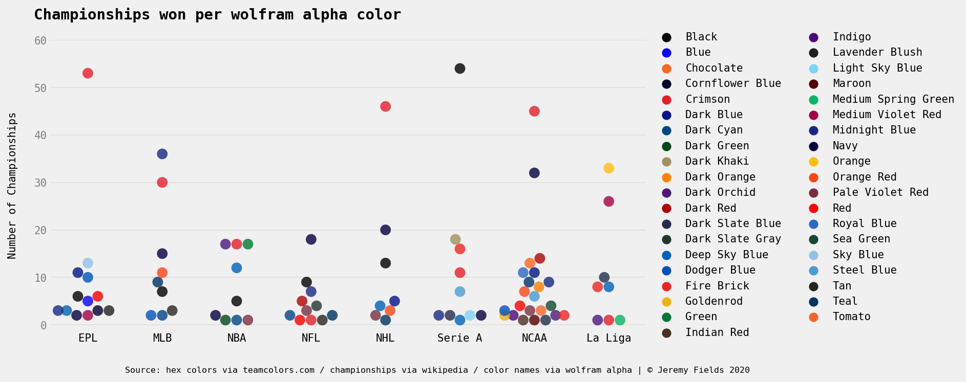
Data around sports team’s primary/secondary colors & number of championships won. Leagues included: NFL, NBA, MLB, NHL, EPL, La Liga, Serie A, NCAAF, NCAAB
Analysis of the data here. You can find the code and data here.
EPL Transfer Market ⚽
Does higher spending equate to more winning? (R, tidyverse)
![]()
Contains transfer data and team points totals for the English Premier League from the 1992-93 season through 2018-19.
I analyzed the overall trends of the EPL transfer market here and analyzed if higher spending equates to more wins here. Link to full project and more cool plots here.
NFL Penalties 🏈
Do the refs play favorites? How have penalties changed year over year? (R, tidyverse)
Scraped data on NFL penalties from 2009-2019 (as found on nflpenalties.com). Contains data on specific penalties (false start, holding etc.) & penalties by phase of the game (OFF/DEF/ST).
Analysis on some common penalty questions here. Link to project here
Experiments in ML/DL/Stats
JokePT2
Poorly training GPT-2 on weird text here
- On a Charles Manson interview
I am against killing the penitentiary
- On Yo momma jokes
Yo momma is so ugly that just after she was born, the doctor slapped her face
Simulating EPL games
Using Monte Carlo simulations to predict the result of EPL games here
Forecasting congressional trading
I used prophet to try to forecast the trend of days between transaction and disclosure dates of senate stock trading here
Data Visualizations
500 Jump Scares, my viz that won the October 2019 r/dataisbeautiful competition
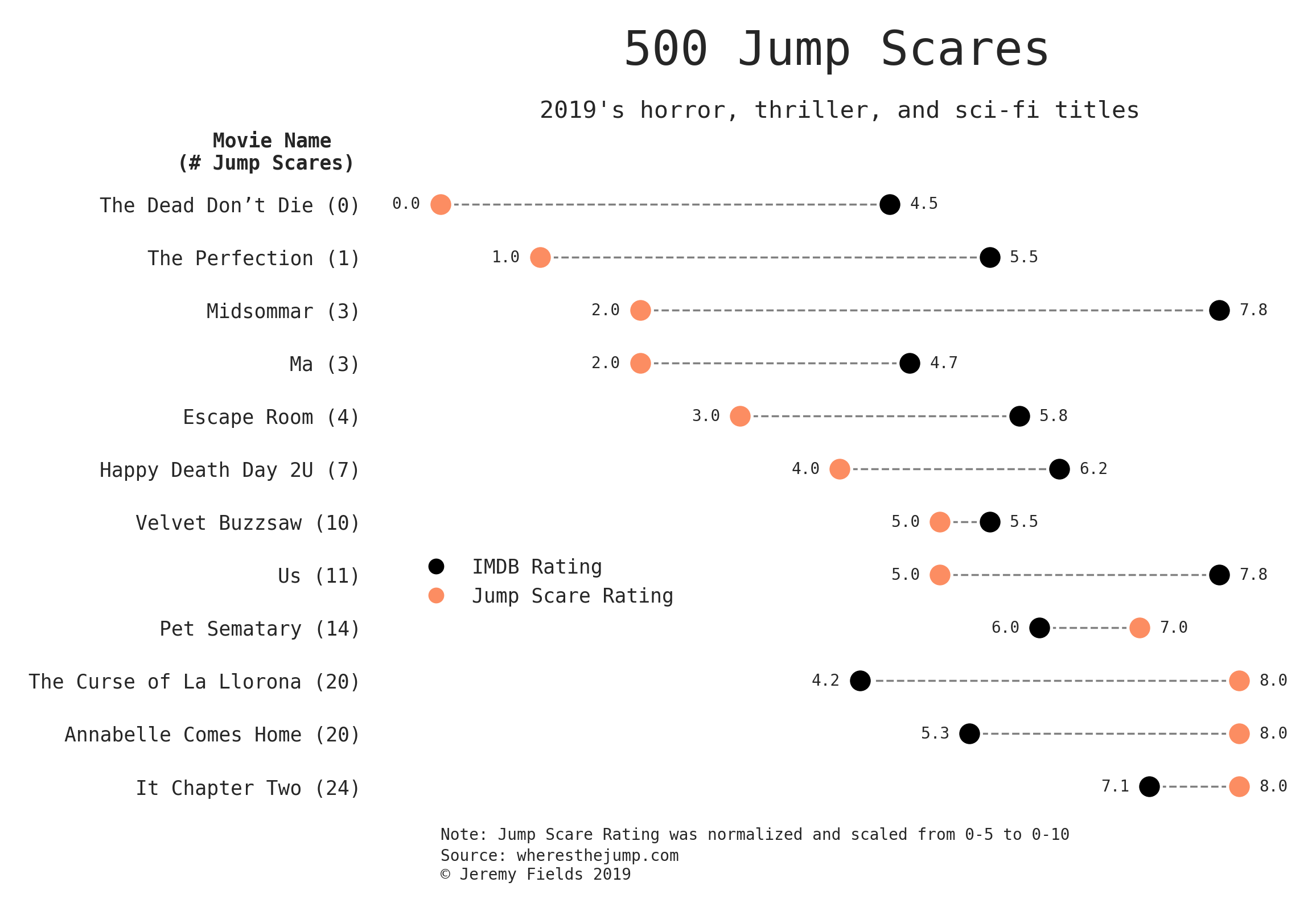
This was created for the October 2019 r/DataIsBeautiful DataViz Battle which centered around visualizing the Jump-Scares for over 500 horror, thriller, and sci-fi movies. I chose to only include 2019 here as this visualization lends itself to a smaller subset of data. Inspired by aaron penne’s dot pairs viz.
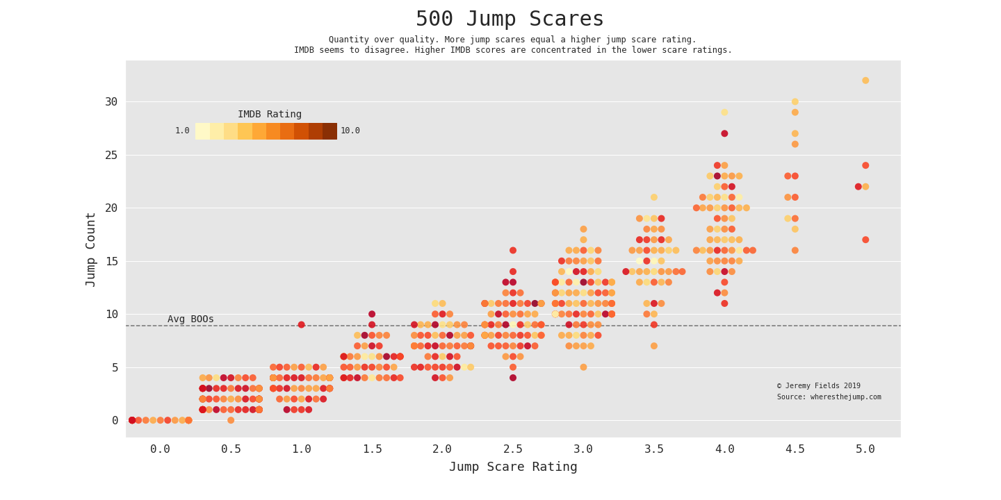
This chart shows a larger trend: More jump scares = a higher jump scare rating. Eyeballing the colors alone, it seems that less jumps (count and rating) translates to a higher IMDB score. Note: this was the winner.
Code: 2019 dot-pair here and all-movie swarm plot here.
Data Pulls
Movie budgets 🎥
Who were the small budget cash cows? What actors rake in the most? (Python, BeautifulSoup)
Scraped data on the top 5000ish highest budget movies ever (as found on the-numbers.com). Contains not only data around budget/profit but metadata like: Directors/actors of said movies, theater count, genre, story source (comic, novel etc) and more.
Link to project here
Company Colors 🎨
Do industries have design relationships? (Python, BeautifulSoup, Selenium)
Contains the brand palettes and logos of Fortune 500 companies. Furthermore, contains a screenshot of said companies websites and the most common colors used on their homepages. This was an odd project/idea for a scraping project but really rewarding to do.
Link to project here
Big 4 League Attendance 🏒🏀🏈⚾
Do people really rather just watch from home? (R, tidyverse)
Contains attendance data for the Big 4 US sports leagues from 2001-2019 (NBA, NFL, MLB, NHL).
Link to project here
Kaggle kernels
Categorical Feature Encoding Challenge
This challenge involved taking a data set solely comprised of categorical features and encoding them while capturing as much useful signal as possible. In this kernel I implemented a thorough range of encoding techniques including feature hashing, likelihood encoding, and sin/cos transforms.
Tinker, Tailor, Scientist, Analyst
This kernel sought to provide contextual evidence to the often asked “What’s the difference between a Data Scientist and a Data Analyst?”, given Kaggle’s 2019 ML & DS Survey. Through looking at Demographic questions, Career questions (like education level, work roles, salary), and Tooling Used (favorite algorithms, ML frameworks, langs) - I discovered some lines of separation between the two titles. TLDR - years of experience, education, and consequentially, salary.
Stand-alone Apps
Favoritify
Not Data Science in the traditional sense (honestly more of a front-end project) but I created this React app, Favoritify, that polls the Spotify API for a user’s top music and displays a personalized dashboard of visualizations. Includes top tracks/genres/artists, how popular they are globally on average, the typical auditory features of your music, and more. Code here. Not being monitored - if broken please send me a note. That being said, please give it a try!